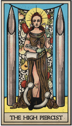
From High Priestess to High Piercist
A Custom Tarot Card for Modern Rite Adornments
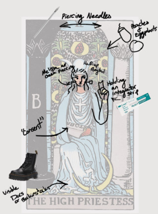 Hiya, I’m Devyn, and I wanted to share some of my thoughts and talk about my process of creating the “High Piercist” custom tarot card that I illustrated for Melissa Reay from Modern Rite Adornments. Melissa reached out with the idea of a custom tarot card design to suit her brand. It was pretty simple: a spin on the classic Rider-Waite High Priestess card with a few fun piercing accoutrements taking the place of the iconography from the original image. Now, me being me, this was kind of a dream job. I personally love pieces that force me out of my comfort zone and give me a chance to learn about funky esoteria. Doing art style studies is also one of my favorite challenges and I always come out of it a little more well rounded as an artist.
The original Artist: Pamela Colman Smith
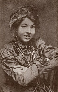
Pamela!
So whose art style in particular would we be studying? That is the first question I ask myself any time I do pieces like this. In this instance it would be Pamela Colman Smith.
It was a pleasant surprise to find out that some of the most iconic artwork of the past 100 or so years was illustrated by a woman. She also was an outspoken supporter of the British women’s suffrage movement, owning her own (although short-lived) magazine and press. In 1909, fellow occultist academic and member of the Golden Dawn, William Rider, approached her and commissioned her to help create a new 78-card tarot deck. It goes without saying that this partnership was pretty golden (ha ha). The illustrations created by Smith have come to be some of the most ubiquitous imagery of the occult inspiring tribute after tribute, including the one that I made for Melissa.
I was heartbroken to learn that she died alone and in relative obscurity.
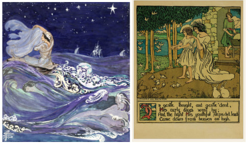
A couple of her other works
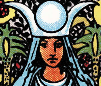
The High Priestess
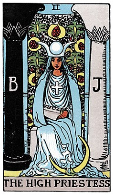 As for the High Priestess card itself, I was pretty much in the dark regarding the meaning and position of the card. I’ve never had my fortune read, or tarot cards drawn before. The High Priestess is part of the Major Arcana, which are the named cards of a tarot deck. They usually depict scenes rather than the more mundane objects seen in the Minor Arcana cards.
Illustrated in Smith’s interpretation of the card is imagery from a plethora of different mythos and cults ranging from Catholicism, ancient paganism, Egyptian pantheons, Hinduism, and even Freemasonry. Trying to explain the meaning behind each element could make its own article entirely. In the most roundabout way, the meaning of the card as a whole: is trusting of one’s own intuition. A call to stand back, reflect, and rely on your own judgement.
Personally, this card has become a special one to me for those reasons. All of this card, its base depiction, the fun I had making the High Piercist, and my own journey and experiences lately, has really made it become one of my favorite pieces of iconography.
Aside from studying Smith’s art style for the custom card, the other very exciting part of this piece was seeing up close the coloring of the artwork.
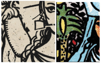
Do you see it?
Let’s get technical: Halftone Printing
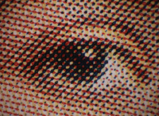 The dot shading and layering of primary colors to create different shades and hues seen here is called halftones. It was actually the first thing I noticed, and the thought of halftone coloring was very inspiring as a personal challenge.
I guess the easiest way to explain how halftone printing works is to describe it as a layering process. In modern printing, it’s done by taking cyan, magenta, and yellow, and stacking dot matrices to create new hues. Color saturation is created by using different or increasing densities of pigmented dots. Each dot matrix is angled separately by the color at a 30 degree differential. For example the black layer might be at a 45* angle, magenta at 75*, Cyan being 15* or 105*, and yellow being 90* or 0*.
Here’s an example with each hue layer separated to illustrate the process in action.
Sometimes you have to see it with your own eyes to realize that the colors aren’t working.
The Rider-Waite cards actually use a simpler and more limited color palette rather than CMYK. This was despite the usage of those colors becoming widespread at the time of the first edition. The use of color in Tarot cards is also very important to the symbolism in each suit. Utilizing a deliberate and limited palette was an artistic and academic choice by Smith and co. While I wanted to maintain as much accuracy as possible, trying to use that original color palette made the image more muted than I had liked. I also wanted to use the colors Melissa had specifically requested, and it wasn’t quite possible with the original color range.
Regarding the inking, line art, and original coloring style, I still tried to keep it as close to the original as I could. For example, I used a digital brush with very little pressure variance to emulate using a real single size pen nib. I kept my hatching and stippling pretty loose and relaxed, also using heavier lines to denote shadows or weight. My rendition is still a bit cleaner with more blank spaces, with more stylized and modern aesthetics.
Melissa’s eyes are bigger and have more eye-whites visible with winged eyeliner. The fruits in the tapestry pictured behind her have more detail with glossy highlights and gradients. It’s stuff that makes it less faithful to the Smith card, but felt more appealing for the purpose of the illustration. Maybe next time I do something like this I could be a little more hardcore on sticking to the reference material. But, I think in the case of this piece, there’s enough of the Smith card skeleton to create an animal that has the same silhouette. You know what you’re looking at and you can see what it’s attempting to recreate, which is a success in itself, I think.
The finished High Piercist
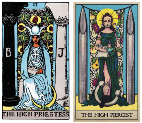
It goes without saying that I had a ton of fun making this card. I’m really happy with how the final product came out. My favorite parts, I think, are how the gleam of the needles look, along with the detail of the crescent being replaced with a septum piercing. All of the changes Melissa requested are super fun interpretations of the imagery in the original card, and I was excited to see it fleshed out from the moment I read her original email. I’m really grateful for the opportunity to create a piece of art like this for someone, and even more glad that she’s satisfied with it too. I’m always happy to have something fall in my lap that really pushes me out of my comfort zone and to try something completely new.
I really look forward to the next artful adventure that I find myself a part of.
Posted in client spotlights

Written by Almostronaut Devyn, Intergalactic Illustrator
First published on February 21, 2026
Make contact
You can also...
Footer

We respectfully express our gratitude and appreciation to live and create on the unceded traditional territory of the T’Sou-ke First Nation - HÍSW̱KE - as well as the lands around the Mississippi (Bulbancha) River where Native peoples have lived since time immemorial. We strive to uphold our mutual values of storytelling and environmental stewardship.
thank you from
Almostronaut
read our
accessibility statement
read our
privacy policy
read about
cookies
explore our
instagram
say hi on
facebook